Bram & Bridle
A fictional saddlery brief, explored as a brand and editorial concept.
Year
2026
Bram & Bridle
Work type
Brand & Editorial
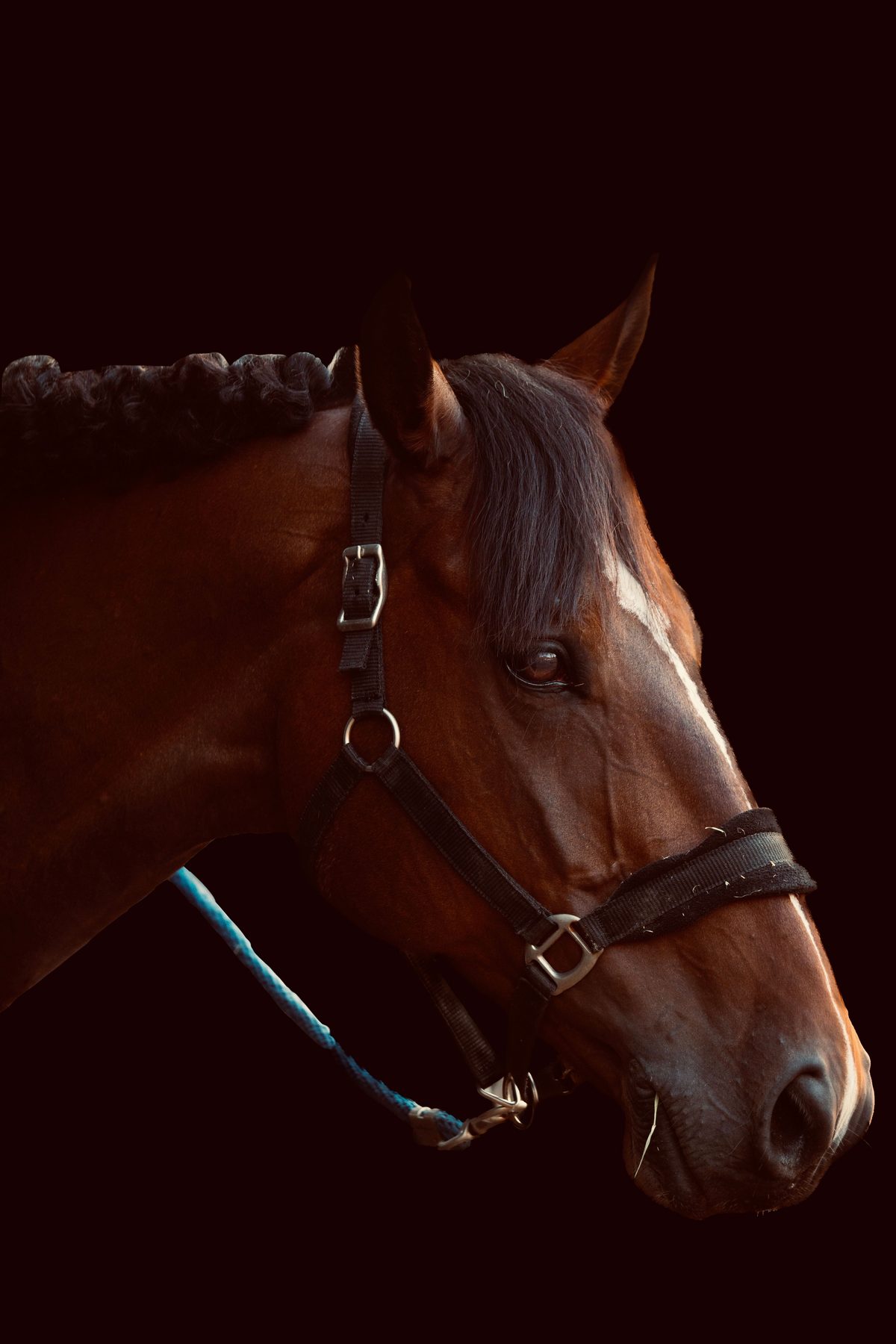
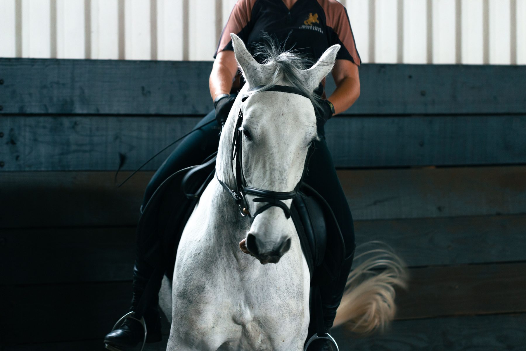
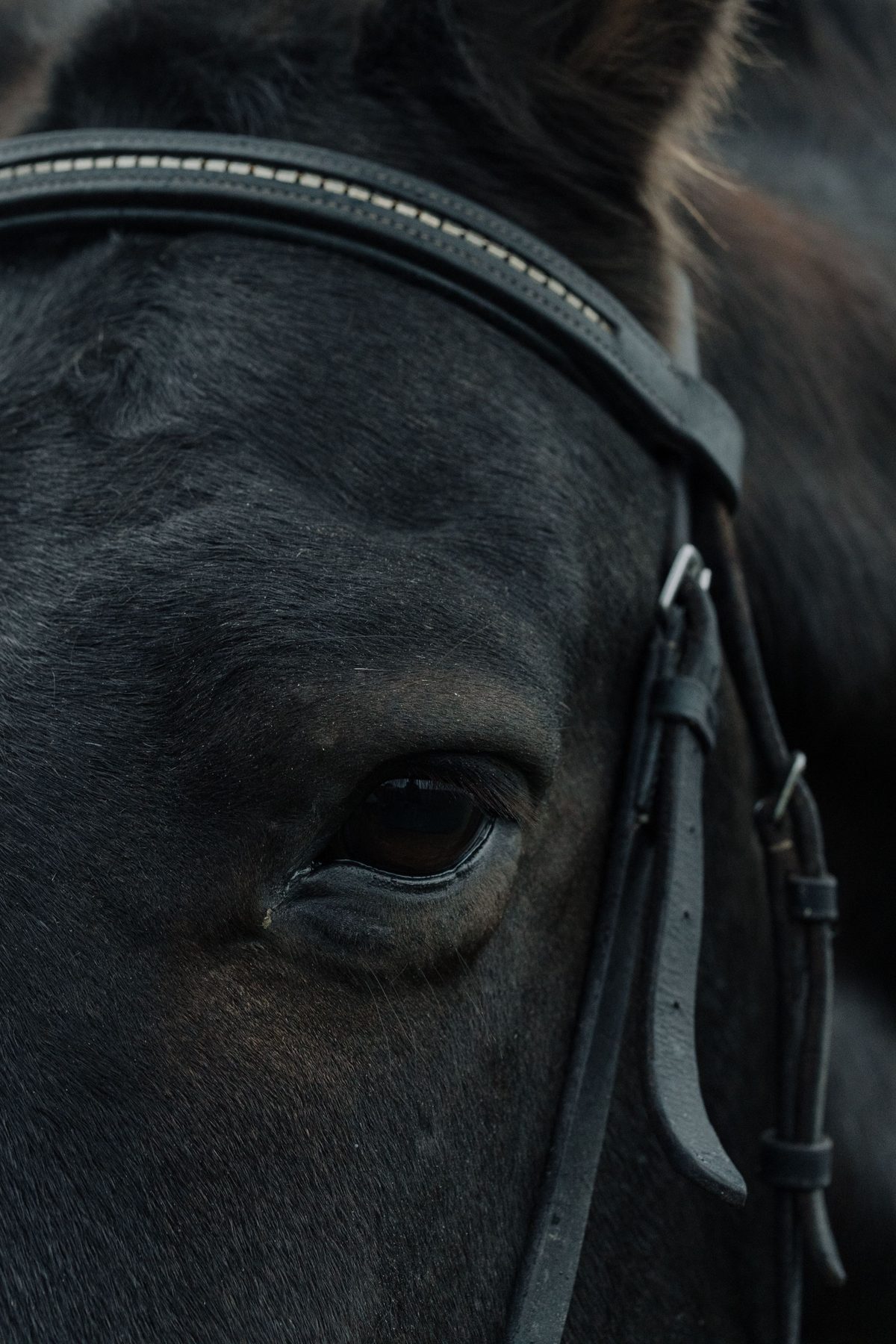
The design question: how can a page show the materials and handwork behind a product?
Bram & Bridle
[The operation]
A fictional saddlery brief, explored as a brand and editorial concept.
The design question: how can a page show the materials and handwork behind a product?
[What was in the way]
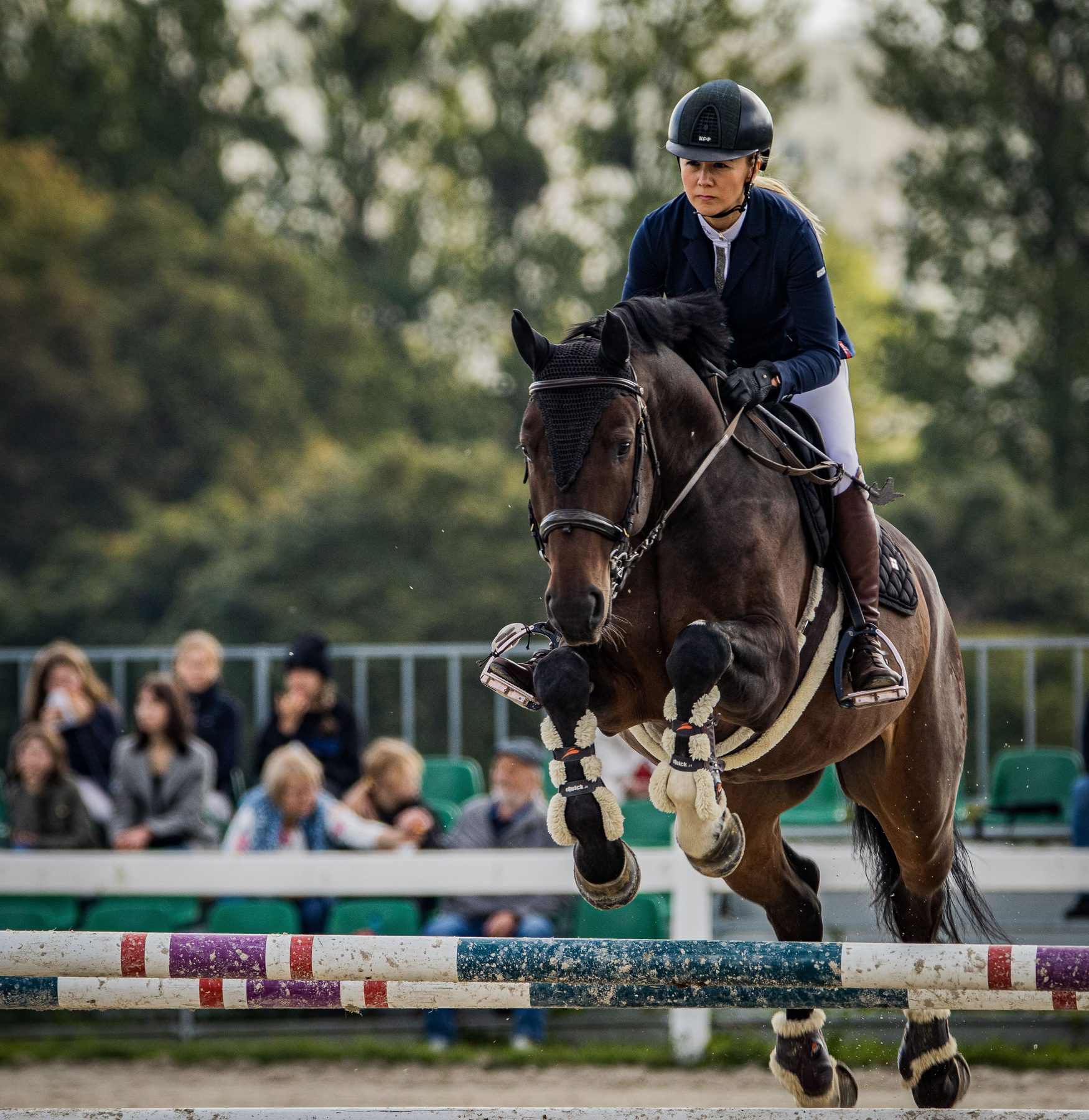
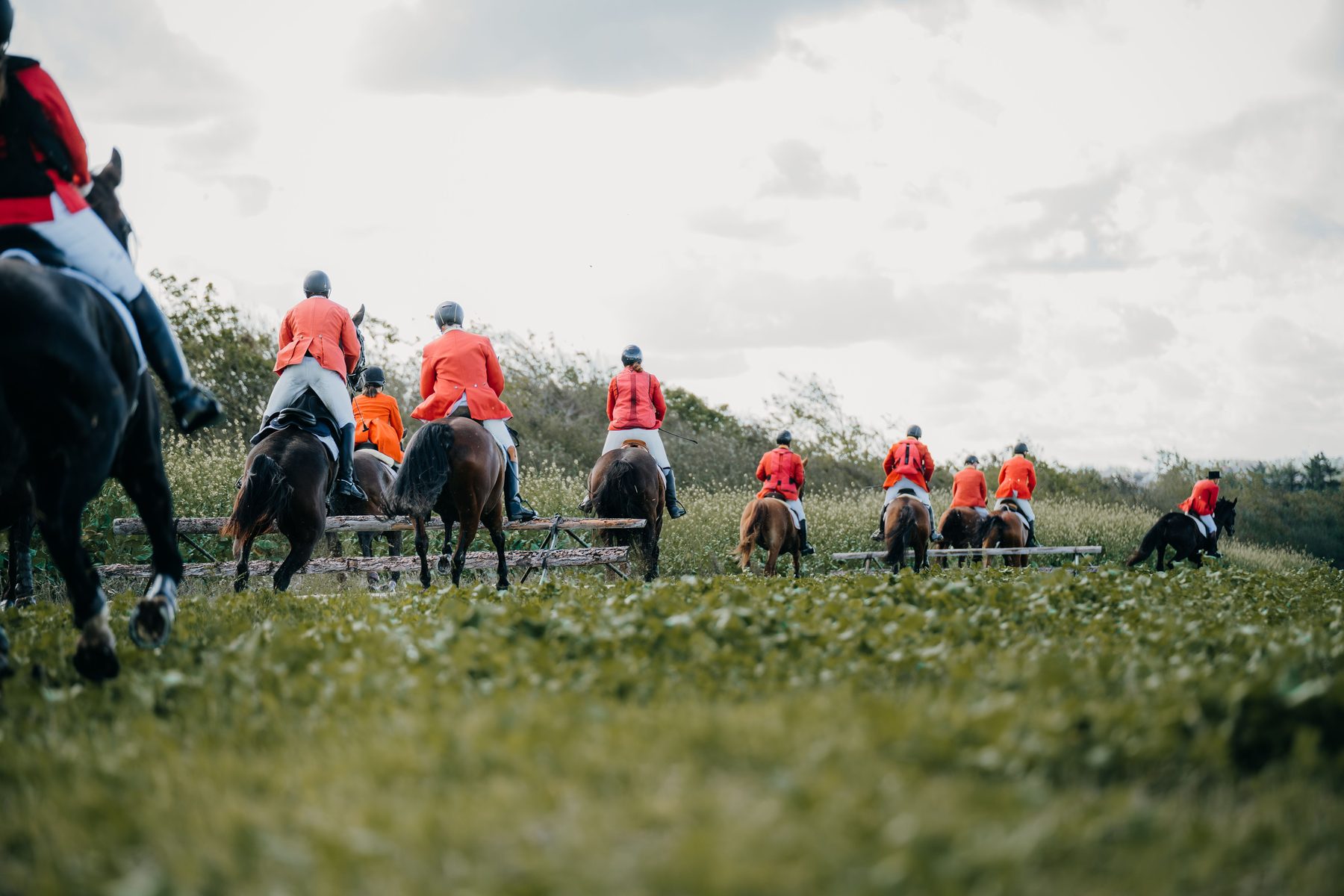
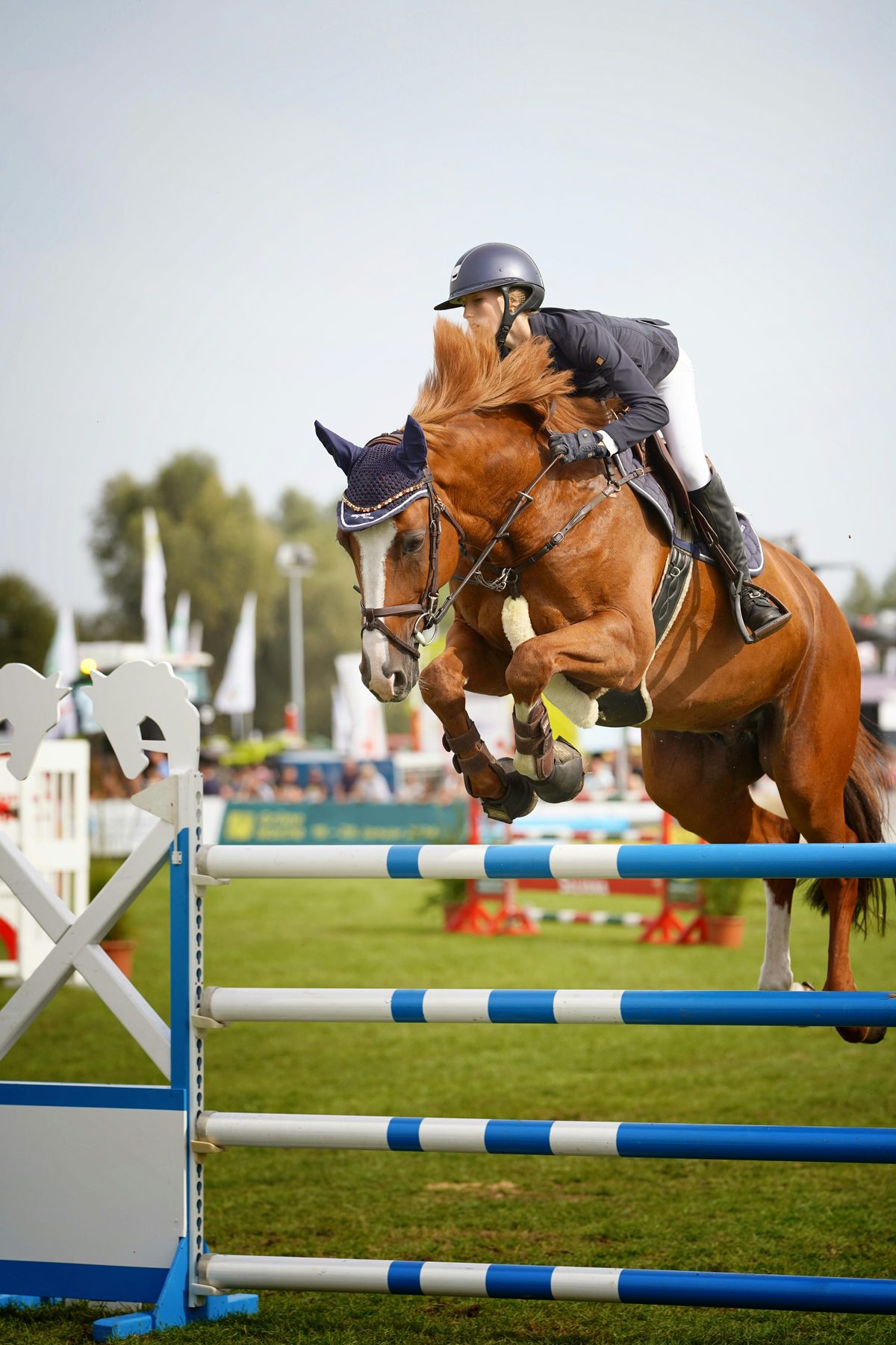
The imagined brief calls for close photography, clear product descriptions and room to explain how an item is made. No workshop history or customer outcome is claimed.
[What we built]
A proposed identity that brings the material into the frame.
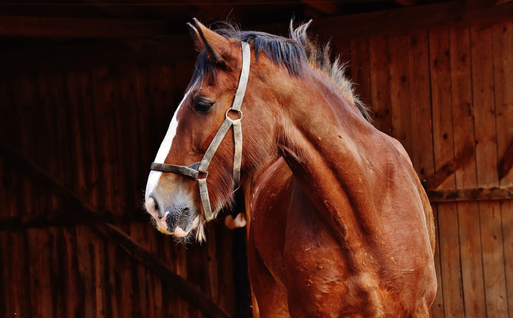
The concept pairs restrained type with close product imagery and consistent catalogue layouts. It illustrates a creative direction, not commissioned client work.
More work